Leanhaus
ARCHITECT Leanhaus • BUILDER Trueline Homes • PHOTO SHOOT STYLIST Grace Buckley Creative • PHOTOGRAPHY Jody D’Arcy • STORY Elizabeth Clarke
Small but concise. The home’s living space fits only what it needs and allows seamless indoor outdoor flow.
Sofa, King Living; Togo Lounge, Ligne Roset; side table, client’s own; Iron Ash sustainable hardwood timber panelling; rug, Armadillo.
Right in the middle of Claremont's hustle and bustle is a little house that is as pro-planet as it is liveable.
Situated on a sloping battle-axe block next to Claremont railway line and opposite Claremont Quarter, it stares directly at the 'ugliest house on the street', bookended by towering apartment carparks.
"It's a complicated block that didn't appeal to many buyers at the time," says architect Ben Caine from Leanhaus. "It was a site that required care, attention and imagination to make it work."
The owner, a young professional, had definite ideas about what she wanted, and Ben's first job was to gain a thorough understanding of her desires. "It's the most important part of the process for me and the first test to see if together we can achieve alignment between brief, budget and site," he says. "Her needs were entirely personal, but it's important to consider future occupants of the home, whether they are downsizers, a couple, or a family. It's not about working to a specific brief at the moment in time; it's about serving the life cycle of that building. It's a crucial part of sustainable design."
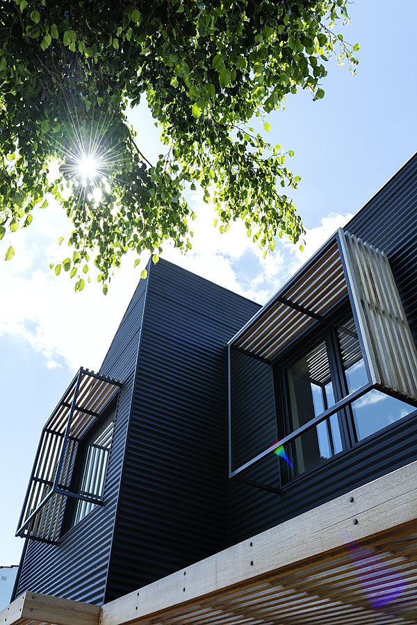
With its iron ash timber slats and robust lines, the exterior is a modern take on Claremont’s classic workers’ cottage.
Colorbond cladding in Monument Matter; Iron Ash sustainable hardwood timber panelling.
Robust, durable and long-lasting, Ben used Matt Finish Colorbond on the external walls not visible to the street.
Colorbond cladding in Monument Matter; Iron Ash sustainable hardwood timber panelling.
The kitchen is fitted with 80's inspired terracotta tiles and green laminate cabinetry, reminiscent of the owner’s childhood. Timber screening provides a contemporary contrast.
Cabinetry, Centurion Cabinets; Paperock compressed paper benchtops; vintage Casalino Casala chairs; protea pendant light by Tim Whiteman; Iron Ash sustainable hardwood timber panelling; blue carafe, Mud Australia; round cushion and sculpture by Kura Studio from Loam, Symbol vase by Nicolette Johnson, tall red carafe and pink and gold small glass tumblers, YEEND; geometric artwork, Emma Lipscombe.
From the kitchen, timber slats create a graphic element and provide a sightline to the living space and back garden.
Iron Ash sustainable hardwood timber panelling.
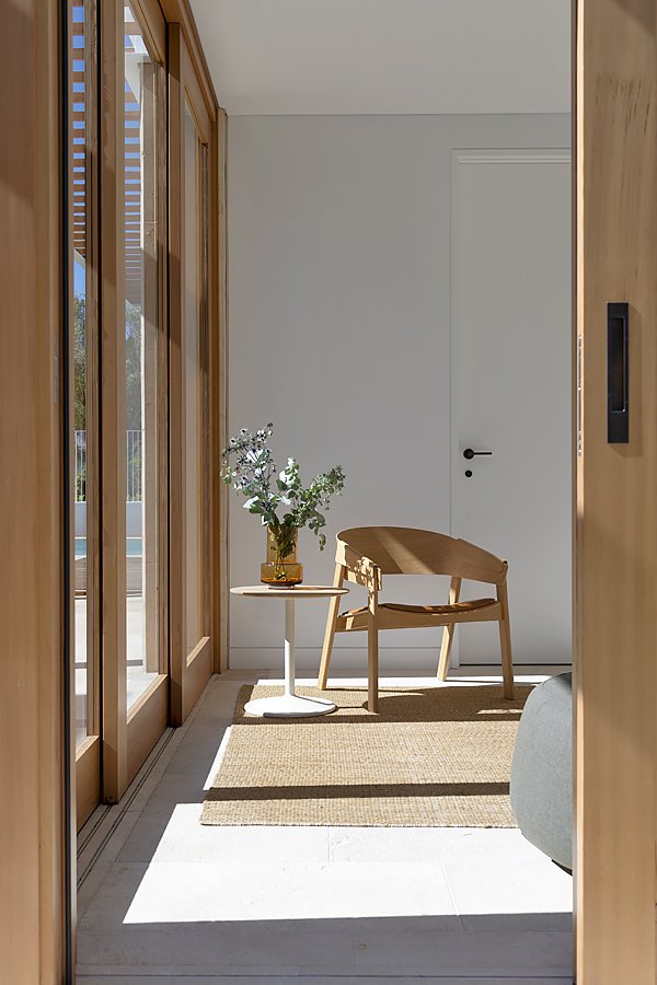
Well placed windows make a corner in the living room a sunlit spot to curl up and relax.
Togo Lounge, Ligne Roset; vintage acrylic side table, client’s own; teapot, Marimekko.
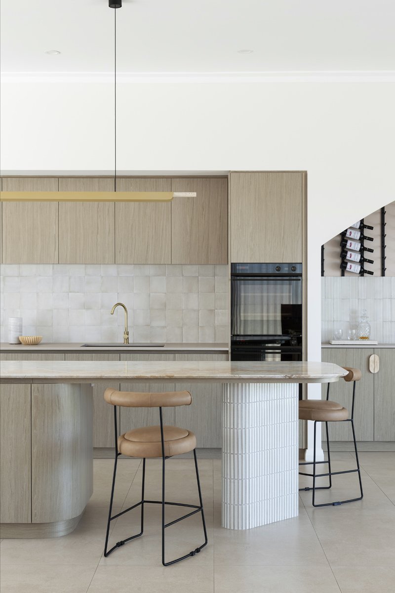
Clean lines, eco-friendly materials and curated décor combine for a clever and stylish kitchen.
Cabinetry, Centurion Cabinets; Paperock compressed paper benchtops; blue carafe, Mud Australia; sculpture by Kura Studio from Loam, Symbol vase by Nicolette Johnson, tall red carafe and pink and gold small glass tumblers, YEEND; geometric artwork, Emma Lipscombe.
Vast windows and statement lighting combine to illuminate the home’s living spaces.
Cabinetry, Centurion Cabinets; Paperock compressed paper benchtops; vintage Casalino Casala chairs; protea pendant light by Tim Whiteman; woven pedestal bowl, Sian Boucherd.
The home's exterior is almost an evolution of the classic Claremont cottage. "The streets around it are lined with old workers’ cottages, 1970s buildings and walk-up apartments, so it was important it appeared consistent but not look the same." Thinking about what a worker's cottage might be built of and look like today, he employed updated materials and a palette to create a modern iteration.
The home’s building materials needed to be sustainable, durable and long-lasting, and a combination of Matt Finish Colorbond and iron ash timber ticked the boxes. The house is composed of a timber frame without any steel supports and is pre-fabricated. "It was assembled like a Lego kit," he says. “Colorbond cladding is on the portion of the home that isn't visible to the street. It didn't make sense spending money on walls that aren't seen."
Glimpses of Claremont and a growing garden form a verdant view from the kitchen table.
Vintage Casalino Casala chairs; protea pendant light by Tim Whiteman.
Stairs lead to the upper floor that houses the master bedroom, ensuite, an additional bedroom and home office.
Blushing Rottnest print, Studio D’Arcy; prism artwork, Emma Lipscombe.
Bird’s-eye view. The dining room as seen from the study above.
Cabinetry, Centurion Cabinets; Paperock compressed paper benchtops; vintage Casalino Casala chairs; protea pendant light by Tim Whiteman; Iron Ash sustainable hardwood timber panelling.
Layers of various green linens reference the bedroom’s lush leafy view. The cork flooring, with its stone-like appearance, feels soft and comfortable underfoot; Bedding and pillows, Loam; cork flooring, Cork Imports Australia; artwork, Emma Lipscombe.
Passive House principles informed the design of the home, including double glazed glass and uPVC frames that keep out dust and drafts.
Iron Ash sustainable hardwood timber panelling.
The timber was used sparingly and mainly on the front façade. A cut-costing measure, it also creates an important first impression. "It's very Scandinavian, tactile and speaks to energy efficiency and sustainability," he explains. "It's obvious to everyone this isn't your typical building."
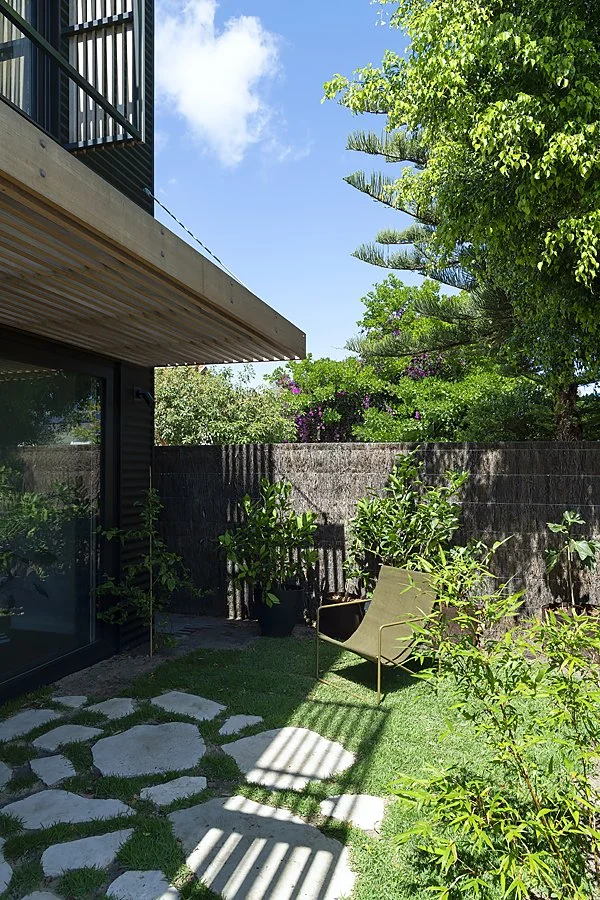
The property is just 180 square metres, and restrictions around small battle-axe blocks meant the home's footprint was limited. "We needed to include a single carport and reversing area, which we created as part of the landscape and front door experience," says Ben. "To the north, we were required to include outdoor living spaces, so the home's footprint shrunk to just 76 square metres."
Owing to its clever inward-looking design, the home exudes functionality and liveability. Entry is through a lobby with access to the lower level that embraces open plan living and a bedroom with adjoining laundry and bathroom.
Stairs lead to the upper floor, where a study peers down to the dining area beneath a raked ceiling. Nearby is a master bedroom with ensuite and an additional bedroom.
The interior finishes collaborated with the owner are distinctive and robust. "She wanted something fun and reminiscent of her childhood home," Ben says. The living area features 1980's inspired terracotta tiles alongside green laminate cabinetry and striking timber screening. The bathroom, wrapped in rich green subway tiles, exudes texture and warmth.
A pink sliding door into the upstairs bathroom is a space saver and design statement.
Cabinetry, Centurion Cabinets; penny round tiles, Osborne Ceramic Centre; Winckelman’s French Porcelain floor tiles.
A pastel palette, penny rounds and graphic floor tiles give the bathroom a cute retro spin.
Cabinetry, Centurion Cabinets; penny round tiles, Osborne Ceramic Centre; Winckelman’s French Porcelain floor tiles.
Upstairs, cork flooring resembling stone feels quiet and comfortable underfoot. A playful bathroom painted in pastels features penny round tiles and pink Corian benchtops.
Ben and the builders took cues from Passive House building principles, with high insulation levels, heat recovery ventilation, and air tightness for a home that keeps cosy and cool with little mechanical intervention. Windows are double glazed with uPVC windows frames to ensure no drafts. The house is fully electrical and installed with efficient energy systems like a heat recovery system for fresh filtered air, a hot water heat pump, and ceiling fans in every room.
There is no denying this is a house built on a tight footprint, but with every millimetre working hard, it is a home that punches well above its weight.
"With a limited budget and difficult site, we created a great outcome," says Ben. "It shows architecture doesn't have to be flashy, just the right solution that is sustainably and efficiently delivered."


